yMap
Description
The yMap component serves as a powerful tool primarily designed for displaying a video. It's an adaptable element that allows both static and dynamic content.
Some uses for the yMap are:
- External search
- Loading search results as an option list
- Setting current location with GPS
- Loading location data from database
Basic Structure
In the following the basic structure of the yMap shall be explained. For the general structure of a yComponent please visit the yBase-components basic-structure.
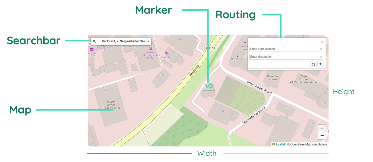
Map
The map represents the actual map module itself, offering a view of a map with attached user interactions.
Search control
The search control is an element which offers the ability to search for locations. It can be displayed in different forms and is adjustable.
Routing panel
The routing panel accomodates different possibilty for setting routes on the map and navigating from A to B.
Zoom control
The zoom control is another customizable control element, which lets the user adjust the zoom of the displayed map.
Properties
Through its various properties the yMap can be configured to suit your needs. The display below provides you with an overview of all the yMap properties.
Properties can be changed directly through three methods:
- Inside the Toolbar, which is positioned in your workarea next to your component right where you need it. It shows the most important properties, thus providing a fast and efficient way to configure your component in the most basic way.
- It may also occur in the Toolbar Extension, which is a seamless extension accesible as a dropdown item of the Toolbar. It extends the functionality of the Toolbar by providing advanced pickers for the most used properties.
- Inside the Detail Panel, which is located in the righthand drawer. Every property of a component can be configured here.
- Generic
- Style
- Map
- Links
- Events
METAread more
The identifier of the component that is unique within a page.
The type of the component. For this component it is -map.
The custom name of the component. It serves for better identification of the component.
The custom version of the Map-component. This can be used to ensure that all components work well together.
The CoreTheme, which will be apllied to the Map. For further information on themes visit the themes page.
The subtheme subordinated to the previously specified CoreTheme, which will be apllied to the Map. For further information on themes visit the themes page.
The group theme is a further variation of the subtheme which is specified especially for variations of a component inside the subtheme. For further information on themes visit the Theme-Manager page.
DISPLAYread more
This property specifies the display behavior of the component. This can be be set to:
- none
- block
- flex
- inline
This property specifies the type of positioning method used for the component. This can be be set to:
- static
- relative
- absolute
- sticky
- fixed
This property can toggle the visibility of the component. The two modes are completely hidden and fully shown.
SIZEread more
The minimum value for the width of the component. This can be set in:
- px
- pt
- em
- vw
- vh
- %
The minimum value for the height of the component. This can be set in:
- px
- pt
- em
- vw
- vh
- %
The value for the width of the component. This can be set in:
- px
- pt
- em
- vw
- vh
- %
- auto
The value for the height of the component. This can be set in:
- px
- pt
- em
- vw
- vh
- %
- auto
The maximum value for the width of the component. This can be set in:
- px
- pt
- em
- vw
- vh
- %
- none
The maximum value for the height of the component. This can be set in:
- px
- pt
- em
- vw
- vh
- %
- none
The flex property sets the length on flexible items. This sets the value in n-fold shares extrapolated to all other components with the flex display within the same container.
PLACEMENTread more
This property creates a space around the component, outside of the top border. This can be set in percent or pixels.
This property creates a space around the component, outside of the right border. This can be set in percent or pixels.
This property creates a space around the component, outside of the bottom border. This can be set in percent or pixels.
This property creates a space around the component, outside of the left border. This can be set in percent or pixels.
This property creates a space within the component, inside of the top border. This can be set in percent or pixels.
This property creates a space within the component, inside of the right border. This can be set in percent or pixels.
This property creates a space within the component, inside of the bottom border. This can be set in percent or pixels.
This property creates a space within the component, inside of the top border. This can be set in percent or pixels.
BACKGROUNDread more
The color of the background. This can be set as a color from a palette or a custom hex color.
BORDERread more
The color of the top border. This can be set as a color from a palette or a custom hex color.
The style of the top border. This can be be set to:
- solid
- dotted
- dashed
- none
The width of the top border. This can be set in percent or pixels.
The color of the right border. This can be set as a color from a palette or a custom hex color.
The style of the right border. This can be be set to:
- solid
- dotted
- dashed
- none
The width of the right border. This can be set in percent or pixels.
The color of the bottom border. This can be set as a color from a palette or a custom hex color.
The style of the bottom border. This can be be set to:
- solid
- dotted
- dashed
- none
The width of the bottom border. This can be set in percent or pixels.
The color of the left border. This can be set as a color from a palette or a custom hex color.
The style of the left border. This can be be set to:
- solid
- dotted
- dashed
- none
The width of the left border. This can be set in percent or pixels.
The radius of the corners of all the borders. This can be set in percent or pixels.
SHADOWread more
The shadow of the component. This is set by the 4 sub-properties x, y, blur and spread of the shadow-property, which can be further read about in the shadow-property section.
OPACITYread more
The opacity of all colored parts of the component. This value is set in percent.
STATEread more
This property can disable or enable the disabled-state of the Map-component.
VIDEOread more
This property defines a link to another component by specifying the componentId or componentName, Page, Component, ID, Event. The data from the link will represent the source of the video.
LIFECYCLEread more
This specifies the function to be called, when the Map is initialized.
INPUTread more
The event that is triggered once the video gets played.
The event that is triggered once the video is paused.
Usage
In this section you will find a collection of application scenarios and examples that illustrate how to leverage the yMap in ways that deviate from its standard behavior, as defined by yBase. This section aims to inspire and guide you through various possibilities, helping you to implement more complex or unique functionalities tailored to your specific needs. General properties that are universally applicable can be found in the yBase usage section.
External search
Being eager to search from a custom input field which can be styled further or searching based on values being set inside a clipboard or yTable, the corresponding source link enables to do this without the need of coding.
How to:
- Create a yInput inside your page.
- Select the yMap again.
- Open the Detail Panel and navigate to the Links category to open the Search group.
- Now create a SourceLink to the
input-stringevent of your yInput.
Loading search results as an option list
With the yMap component, you can execute an external search. Furthermore, you can even load the search results provided by the map.
As prerequisites, proceed to execute External search and come back to this example when done.
How to:
- Open the Detail Panel and proceed to Events, unfold Search to modify
EvtSearch. - Associate a custom JavaScript function to the yMap. This function will be invoked every time an external search is done.
- Include the provided JavaScript snippet below to implement a loading function.
Code example:
With this script, each search triggers this function to invoke new data inside a ySelectionPicker.
// function onMap_2_EvtSearch (apiObject, component, eventData) {

const results = [];

eventData.data.forEach((entry) => {
  results.push(
    new apiObject.types.optionListValue([entry.x, entry.y], entry.label)
  );
});

const select = apiObject.ui.getObject(3, "y-selection-picker", "y-page", 1);
select.set("style", "list", "optionList", results);
// }
Setting current location with GPS
The current yMap allows the developer to directly locate the user and create a marker. This can be done without any coding, by toggling allowLocate.
How to:
- Open the Detail Panel and navigate to the Style category to open the Map group.
- Now toggle
allowLocatetotrueand allow the determination of your current location via the notification of the browser.
Loading location data from database
The yMap component enables you to load data received from outside and center the map itself.
For instance, you could set up a function that gets executed when selecting a table record, which contains location data of a customer.
How to:
- Create a yTable in your application.
- Open the Detail Panel and proceed to Events, unfold Input to modify
EvtListSelect. - Associate a custom JavaScript function to the yMap. This function will be invoked every time a record of the table is selected.
- Include the provided JavaScript snippet below.
Code example:
With this script, each selection of a table record will center the map, based on the coordinates provided by the record.
// function onTable_3_EvtListSelect (apiObject, component, eventData) {
// get lat and lng which is  written as xx,xx;yy,yy
const data = eventData.data[0];
const values = data.location.split(";");

const lat = values[0];
const lng = values[1];

const myMap = apiObject.ui.getObject(2, "y-map", "y-page", 1);
myMap.set("style", "map", "centerCoordinateLat", parseInt(lat));
myMap.set("style", "map", "centerCoordinateLng", parseInt(lng));
// }